It perhaps gives you an idea how busy our daytime working lives have been in recent months that this is the first time I've sat down and written a blog entry since our prelude to the London Film Festival in October, and the one before that was way back in March before I hopped off to Japan. Both Camus and I have media-based day jobs that don't pay that well and which frequently eat into what spare time we have, and best intentions thus too often fall by the wayside.
Not so long ago I gave serious consideration to winding the site up to focus on other pursuits (video production and political activism are both huge time swallowers), but having put so much time and effort into what started out as such a small project almost twelve years ago, the current contributors have decided we want to keep it going. But we've acknowledged that if we're going to do so, we're going to have to make a couple of significant and frankly long overdue changes.
As you may or may not know, the site itself was created and continues to be administered by myself in Abode Dreamweaver, with considerable help on the design from our good friend and occasional contributor Tonsofun. The reasons for doing it this way were initially driven by simple economics – I had a copy of Dreamweaver as part of an Adobe package, and doing it myself would thus cost next to nothing, just take a bit of time while I learnt a few of the basics of web design and administration. Back when we started, the cost of having someone else put together your web site was seriously prohibitive for anyone on a budget (it probably still is), and build-it-yourself-from-templates sites such as SquareSpace or Wordpress were an unknown quantity. The site's earliest incarnation was unsurprisingly primitive, but over the years the layout developed, and the name switch from DVD Outsider to Cine Outsider gave us the welcome chance to revamp the look (as well as the supremely messy file structure), something that evolved further in the years that followed. All the while I've continued to update and administer the site using Dreamweaver for the simple reason that in spite of its restrictions (I still only know the basics and a smattering of HTML), it does give me complete control over the look and content. And with the site generating no income (to say I dislike advertising is understating the facts) and my daytime wages frozen for the sixth year in a row, I have the advantage of being as cheap as I ever was.
Times, however, are a-changing. Actually strike that. They've already changed, some time ago. As you will doubtless be aware if you've ever tried to access our site on your smartphone, there's not a single page on it that is remotely mobile-friendly. Now despite being constantly weighed down with work, I'm fully aware that phones and tablets have started to outstrip desktop computers as the preferred device for accessing the net, and we're not exactly making it easy for those of you who chose to access it this way. Thus over the past year I've explored a number of solutions for having a mobile version of the site to sit alongside the desktop one. Some of these I couldn't get my head around, others offered templates that just wouldn't have worked with the way our content is organised.
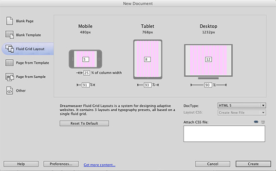
Recently, however, I was introduced to the concept of responsive design and fluid grid layouts, something now widely used on the web that allows pages to switch their layout automatically depending on the screen size. I was aware of the concept, but was not aware that you can create pages in this format in Dreamweaver, though doing so is not as straightforward as would have liked on the version I'm stuck with because I won't sign up to Adobe's Creative Cloud (my reasons for this I've already made clear in this earlier blog [link]). What this does mean is that I have the tools I need to make the site up to date and make it mobile and tablet friendly. It's now just a matter of giving it a go, but watching a few online introductory tutorials has made it clear that the process is very different from how I've been working for the past 11 years. I've thus got quite a bit to learn and am likely to stumble a few times before getting it even remotely right. Professional web designers feel free to mock.
The aim is to have the front page and the news and review templates in place early in the New Year, which should mean that all new reviews and news stories will be in the new format. Converting the thousands of existing pages into the same format will take considerably longer, but three of us will be working to try and make that happen over the course of the next few months. Obviously reviews will be prioritised over past news stories, which I can't imagine are accessed that often. This will result in the site undergoing another layout redesign, one that better adapts to the three device formats, although we are looking to try and retain a degree of its current visual and structural identity.
We're also planning to finally set up a Facebook page, something I've resisted for some time because of that company's shoddy record when it comes to privacy and user data, and their requirement to tie any business Facebook page to a what they regard as a legitimate personal one (it's no surprise that the parody of Facebook that appears in the video game Grand Theft Auto V carries the more appropriate moniker of Life Invader). This doesn't mean I'll be setting up my own Facebook page to make this happen, as this addition to the site will be primarily handled by my more sociable colleague, though the page itself will be managed by us both. Once up and running, it should provide a forum for feedback and direct discussion with individual writers, and a good way to share small snippets of information that don't quite warrant an entire news story of their own.
So why am I sharing all this information in advance? Well, partly to assure those of you who repeatedly wonder why the site is not remotely mobile friendly that we are aware of this and are intending to do something about it in the not too distant future, and partly as a heads-up that the look of the site is soon to change again and that there will be a lengthy period of transition to the new layout. But the main reason is in landing already busy people with a ton of extra work, by committing our intentions to a blog in this manner, I will hopefully feel obliged to see it through rather then put it off for another year or so. If nothing has changed by April 2016, you'll know something bad happened, the workload proved too much or I couldn't get the whole fluid grid layout thing to work. Here's hoping we're all witness to none of these catastrophes. |
